Kern
A tool for choosing fonts that look good together. Instead of relying on someone's favorite pairs, it measures the fonts themselves and suggests pairs whose letters are sized and shaped to match.
Font pairing scored against measured type data, rather than vibes.
Open kern-fonts.vercel.app468
Families measured in a real browser
5
Roles: display, text, UI, mono, accent
4
Scored dimensions per pairing
0
Runtime font loads needed to score
Why we built it.
Pairing tools show two typefaces on a card and wish you luck. The recommendation comes from a hand-kept list of pairs somebody liked, and the reasoning behind it, including why a third face would break the set, stays out of view.
What a build needs is a type system: two to five roles working together, exported as something a stylesheet or an agent can use directly.
The decisions we made, and why.
This part gets into the technical detail. If that isn't your thing, the short version is at the top of the page.
We measured the catalog once, in a real browser
We rendered and measured every family for x-height ratio, character width, and ink density, and the numbers ship inside the bundle. Where a family carries no metrics, we derive them from `actualBoundingBoxAscent` on a live canvas. Scoring needs no runtime font loading and no guesswork from a name.
We score relationships, then show the reasoning
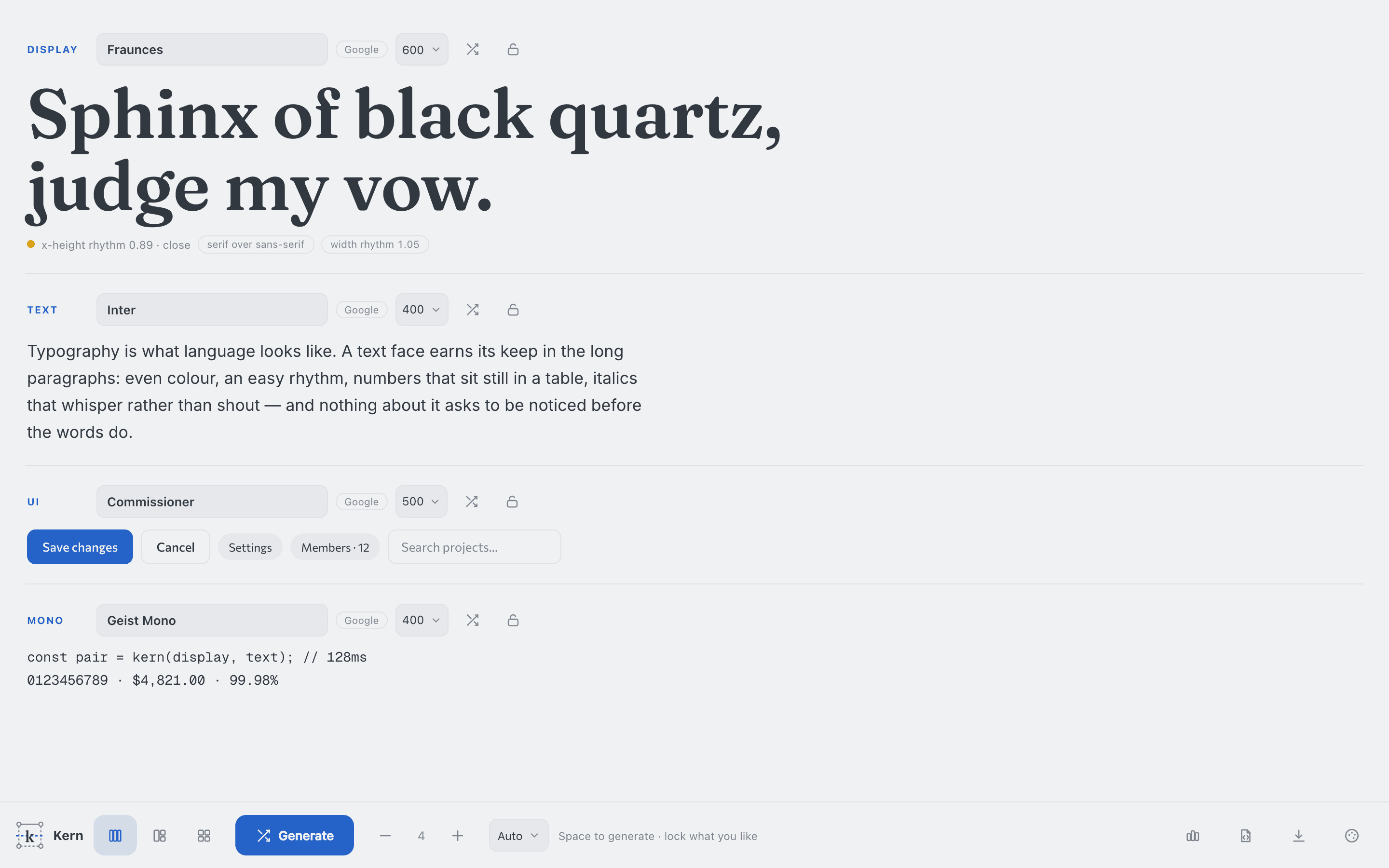
A pairing scores on classification contrast, x-height rhythm, width rhythm, and typographic color. The reasoning is right there: chips under the display slot read things like 'x-height rhythm 0.89 · close' and 'width rhythm 1.05'. A score you can't trace is an opinion with a number attached.
It deals pairs rather than prescribing one
Repeat calls return different pairs by design. Kern offers several good answers rather than one correct one. It shows pairs that satisfy the measured constraints, with the numbers alongside, so you can disagree.
What we only learned by testing.
Every item below is a real problem we found by measuring, and each one has a fix behind it. We share them because they tell you more about how we work than the features do.
Mood words can't promise typographic classification
The catalog carries usage tags rather than classifications. So a 'geometric' filter means sans-over-sans, not geometrically classified faces, and until we caught it, the tool promised more than its data could deliver. It now states the rule each mood applied, and claims only the precision it has.
We checked the engine's advice against the engine
Our own site needed a free stand-in for a commercially licensed grotesque. Instead of picking by eye, we queried the catalog and chose the substitute on measured x-height: 0.750 against the mono's 0.746, a ratio of 0.995. That's the calculation Kern exists to perform, and it held up in real use.
Superfamilies are the reliable deal
Faces designed together as a family score consistently well. That's unsurprising, and worth encoding rather than rediscovering, so we added them as their own category in the hand instead of leaving them to emerge from the general scoring.
Built with, and still open
- TypeScript
- Vite
- Canvas metrics
- Google Fonts + Fontshare
Nothing outstanding right now. It does what we built it to do, and we've described its known limits above.